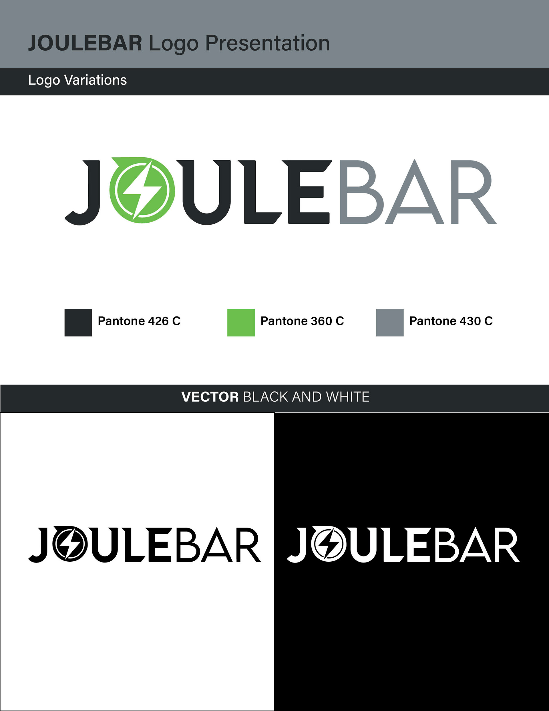
The logo for "Joule Bar," an energy bar brand, combines a minimalist wordmark design with a clever play on the word "joule" by incorporating a unique element within the letter 'o.' The logo aims to convey energy, vitality, and the brand's focus on providing a boost of power through its products.
Overall, the logo for "Joule Bar" merges a clean wordmark design with a clever and visually engaging element, utilizing the letter 'o' as a circle with a lightning bolt. This design perfectly represents the brand's energy concept, providing a memorable and visually appealing identity for the energy bar brand.